Udaan V2.0
Mobile App Design . User Interface . User Experience .
Project Overview
UDAAN is a mobile Learning Management System (LMS) aimed at providing accessible education through structured online courses. The existing app (Version 1.0) required a UI/UX overhaul to enhance usability, align with modern design standards, and address user pain points. The redesign project was scoped for a 1-month timeline and focused on delivering a comprehensive, user-centered design solution.
My Role
UI/UX Designer, Graphics, Researcher
Project Duration
Mar, 2025 - Apr, 2025
Tools
Figma, Illustrator
Platform
Cross Platform Mobile App
Skills Applied
Research, Competitive Analysis, Style Guides, Lo-Fi Wireframing, Hi-Fi UI Design
The Problem
The existing version of the app was limited in features, featured an outdated design, and suffered from a complex, cluttered interface. It lacked a clear user flow, often leading to confusion and distraction during use. Navigating the app was particularly challenging for existing users, reducing overall usability and engagement.
With plans to introduce additional features and enhanced functionality, stakeholders recognized the need for a complete revamp — aiming to deliver a more intuitive, modern, and user-friendly experience through a redesigned version.
The Objective
The primary goal of the new version of Udaan was to simplify navigation, ensuring that users of all age groups could effortlessly find what they were looking for. The core idea was to create an intuitive and distraction-free experience, allowing users to access relevant content with ease.
Given the diverse range of courses offered by the organization — from bridge course preparation for +2 students to entrance exam preparation for fields such as Loksewa, engineering, and medicine — the application needed to support a scalable and organized structure.
The redesign aimed to establish a robust and future-proof platform capable of staying competitive in the market for the next 2 to 3 years.
Design Thinking Process
The design process was guided by a design thinking approach, which offered a flexible, non-linear framework for problem-solving. This methodology allowed me to empathize with users, define key challenges, ideate creative solutions, and iterate quickly—ultimately leading to a more user-centered and effective design outcome..
Initial Research
To initiate the revamp of the application, we began by collaborating closely with the client and key stakeholders to align on the vision and objectives. Through a series of planning sessions and brainstorming workshops, we explored various ideas and outlined how we envisioned the new application to function and feel.
Following these discussions, we adopted a modular approach to features, ensuring each module seamlessly connected to a well-defined user flow. During the first phase, we developed a comprehensive information architecture and finalized the primary navigation system.
Additionally, we identified both direct and indirect competitors, conducting a detailed competitive analysis to evaluate the features we aimed to implement. This analysis provided valuable insights and helped us clearly define the structure and direction of the new design. Once finalized, the structural foundation of the application was locked in for further development.
Summary
The redesign process began with collaborative sessions involving the client and stakeholders to align on the product vision. Multiple brainstorming meetings were conducted to explore potential solutions, leading to a modular approach where features were mapped according to user flow. A comprehensive information architecture was developed, and primary navigation was finalized early in the process.
A detailed competitive analysis was conducted to benchmark the application against both direct and indirect competitors, helping define the overall structure and feature set. With clear direction and structure in place, the project moved into the execution phase.
Given the tight 1-month timeline, efficient collaboration was crucial. Regular update meetings were held every two days to track progress, align on next steps, and ensure the project stayed on course.
information architecture
During the first phase of the project, a comprehensive information architecture was developed to establish a clear content structure and hierarchy. Alongside this, the user navigation paths were thoroughly analyzed and finalized to ensure an intuitive and seamless user experience across the platform.
Competitive Analysis
We began the redesign process with a thorough competitive analysis, identifying both direct and indirect competitors to evaluate their strengths, weaknesses, and feature offerings. This helped us benchmark industry standards and uncover opportunities for improvement. By mapping our desired features against competitor platforms, we gained a clear understanding of the structure and user experience we wanted to achieve. These insights guided the finalization of the app’s core architecture, which was then locked for the next phases of design.
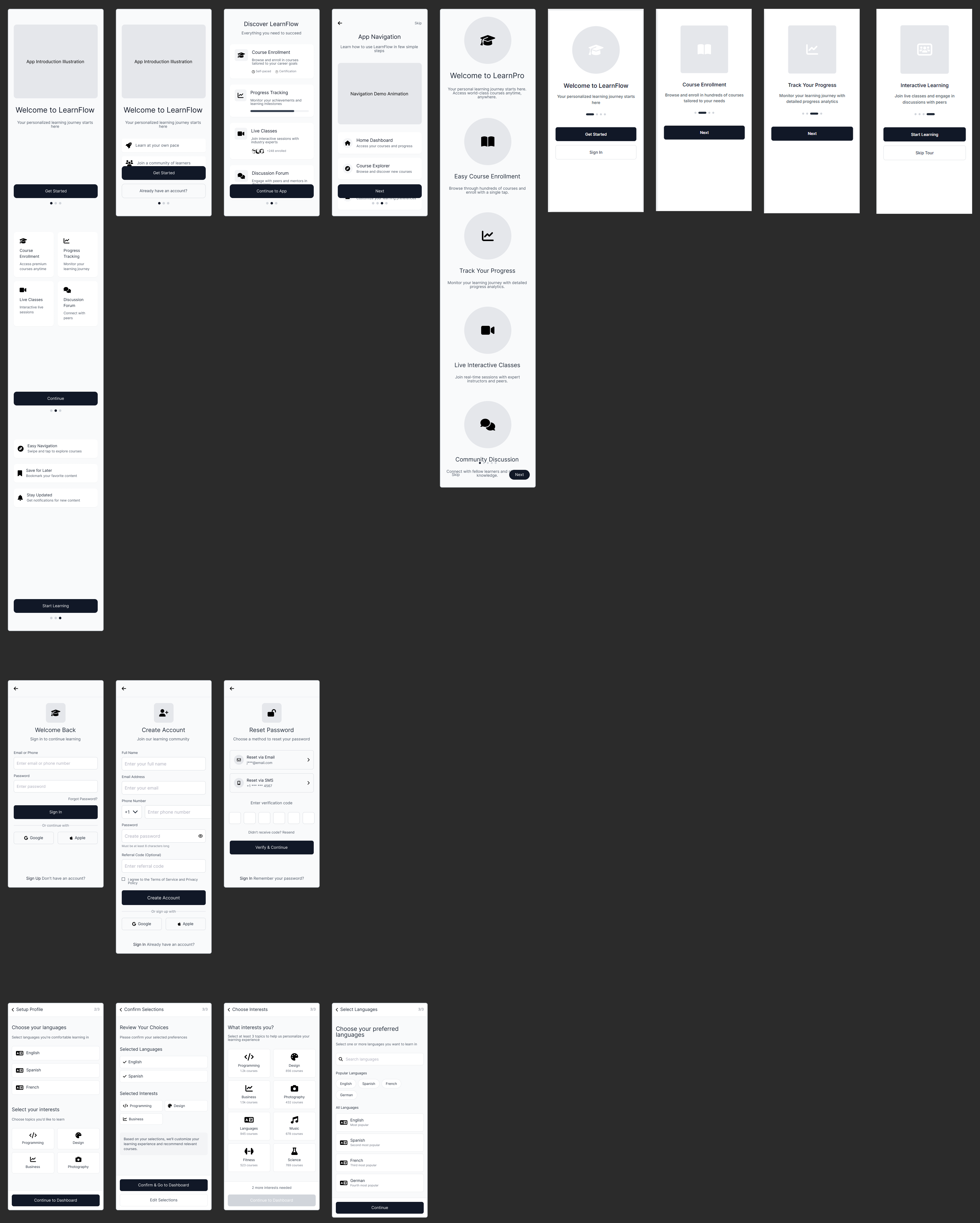
Wireframe
We began the design phase by creating multiple wireframe variations based on the sitemap, which was developed with the assistance of AI tools. One tool worth highlighting is UX Pilot, which significantly streamlined the process of idea generation and structural planning. These wireframes helped us visualize key user flows, validate layout decisions early, and iterate quickly before moving into high-fidelity design.
Now lets define the final design’s visual aspects
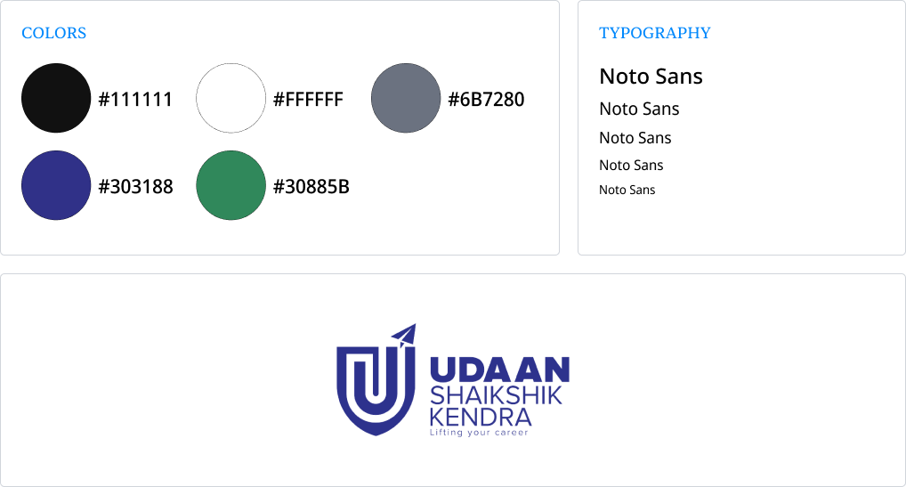
To establish a consistent and appealing visual identity, I created moodboards and defined the overall visual style for the application. This included designing the logo, selecting a cohesive color palette, and choosing typography that aligned with the brand’s tone and target audience. These foundational elements ensured visual consistency across the entire user interface and helped set the tone for a modern, accessible learning experience.
Mockup
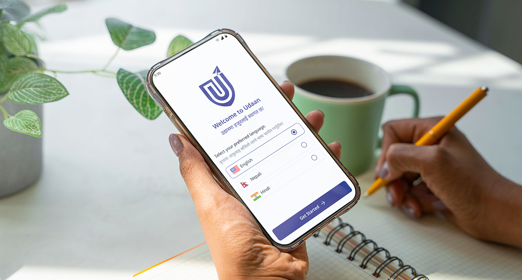
Once the wireframes were finalized—with content alignment and a well-defined style guide in place—the design process moved into the high-fidelity stage. This phase brought the interface to life with visual details, interactions, and a polished look that closely reflected the final user experience.
Please feel free to see the Figma file using the link provided below,
Udaan V2.0
key takeaways and learnings
As a part-time freelance project, this experience taught me valuable lessons in time management and the importance of aligning schedules with clients and stakeholders—ensuring mutual respect for each other's time and commitments.
One of the most impactful learnings was understanding how to effectively map and align the stakeholders’ vision with the design process. This alignment proved crucial in achieving a final outcome that met both user needs and business goals.
Additionally, the project provided an excellent opportunity to deepen my understanding of Learning Management Systems and explore the nuances of designing for cross-platform mobile applications. It was a rewarding experience that strengthened both my design thinking and communication skills.
If you would like to talk about a project and work together, drop me your message!
I am happy to connect with you.